
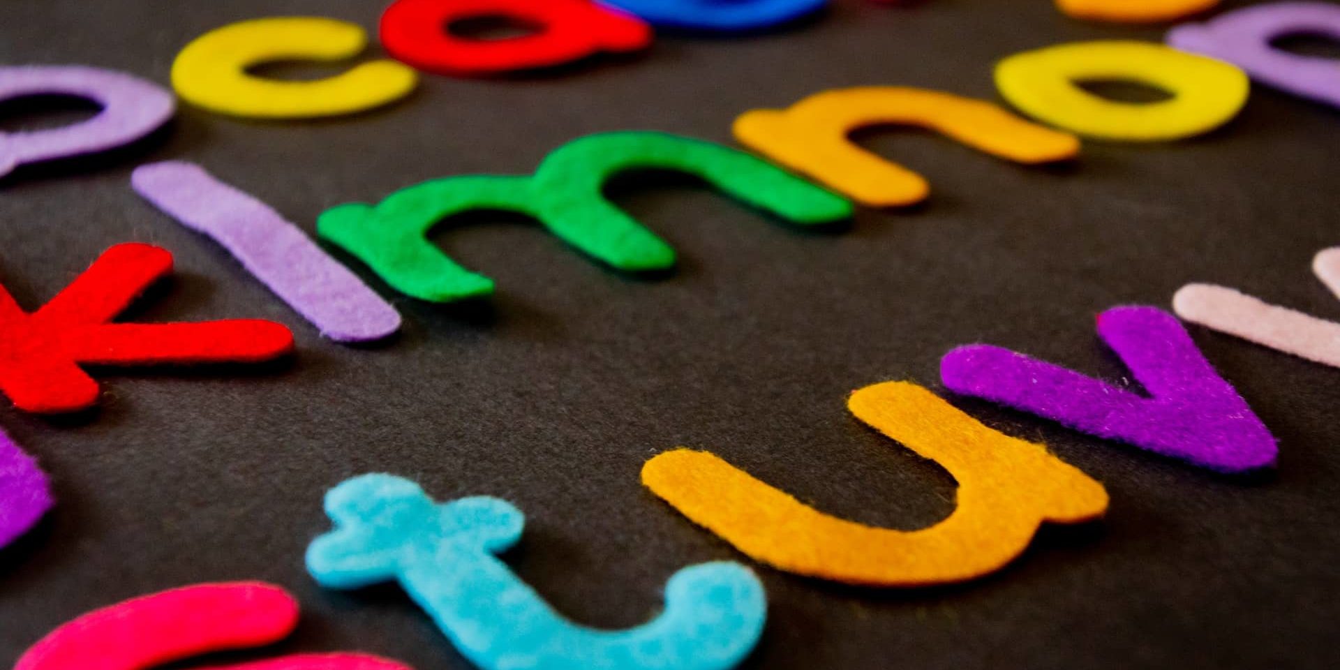
In design, there really isn’t the right thing for anything but, of course, every design element corresponds to something in it. One of the few things that make or break design is the color and the font of a design. There really isn’t a formula to it but we have a few tips on how you can choose the right color for your brand and what fonts you shouldn’t use for your business.
What font and color choices are the best to use for your brand?
How do you really know if you’re using the right color for your brand? The easiest way is knowing your color wheel and by knowing a bit about color psychology. Be clear on what you want to portray to your customers/audience. Do you want to be perceived as a brand that’s vibrant, friendly, professional, serious? Learn the meaning behind the colors.
Color psychology will help you decipher if you have the right color for your brand. Colors can work together to create a unique set of emotional connections to your brand. What is the importance of color psychology in branding?
Color is dependent on personal experiences. A study called “Impact of color on marketing” found that 90% of quick judgments made on products are based on color. Colors influence how customers see the “personality” of the brand. Color for your brand is an important element when creating a brand identity. Upon studying, choosing the right color is actually predicting consumer reaction to color appropriateness.
Now, let’s see. Have you ever heard of the five dimensions of brand personality? A brand’s personification provides insight on what’s the best way to communicate with its audience.
To start off, by definition, brand personality is a term for the human characteristics or emotions attributed to a brand. Brands use this to identify their customers and then make sure that their sales and marketing efforts cater to the specific demographic they’re targeting. Marketing professionals usually divide these personalities into five categories or dimensions. Some brands may overlap all five.
Confused yet? Let’s break down the five personalities. These personalities are:
- Sincerity (down-to-earth, honest, wholesome, cheerful)
- Excitement (daring, spirited, imaginative, up-to-date)
- Competence (reliable, intelligent, successful)
- Sophistication (upper class, charming)
- Ruggedness (outdoorsy, tough)
Let’s break these down even more.
Sincerity
- This personality is often associated with brands that their customers find as down-to-earth, honest, genuine, authentic, etc. Customers often describe these brands as brands they feel the most comfortable and feel familiar with. Brands can also use personalities who share the same vibe as them who can help uplift the sincere traits of the brand. You can take Filipino water commercials such as Absolute and Nature Spring that markets their water as the water used in every home, specifically targeting moms who nitpick every detail for her family.
Excitement
- Brands that have this personality are often referred to like brands that are daring, spirited, creative, imaginative, and cutting-edge. These traits associated with brands are what appeals to their customers, giving them a sense of adventure and fun. Common customers would include young adventurous professionals who crave adventure in their lives, or even those who just want to be ahead of the mainstream. You can just check out any car commercial there is for that sense of adventure that you look for.
Competence
- Competence in brands is associated with their reliability, intelligence, success, responsibility, dependability, efficiency, and more. Companies that market their brand as competent give them that edge and that confidence to compete with other brands. Some brands that can be associated with being successful and intelligent are phone companies like Samsung and Apple where their products display a wide set of possibilities for the consumer, empowering them to be able to do more with the help of their products.
Sophistication
- Companies that market themselves as a sophisticated brand usually come with being branded as elegant, radiant, glamorous, and high-end. Brands like these may even pose as brands for the upper-class or products for the wealthy because more often than not, these sophisticated brands are targeted towards those who live or want to live a more glamorous life. Designer brands like Tom Ford, Chanel, Pandora, Cartier are examples of these.
Ruggedness
- By the name itself, brands with a more rugged outlook are those who gravitate towards practicality. Outdoorsy, tough, strong are some traits of these brands. Brands that have this personality are often put to stand against the test of time and see how long their products last. Some examples would be Timberland, Old Spice, and more, especially agricultural products, because these are the ones that usually need to stand against time. For these brands, durability means greater wear, and that translates into more bang for the buck, a powerful selling point.
Now, to connect it to what the right color for your brand should be, you should know that every color is correlated to a specific trait. Here are the meanings.
Primary:
Red
- Red is physical. It speaks courage, strength, energy, masculinity, excitement. It is a powerful color that catches the attention of the viewer right away. Some brands that use red as their color ire Coca-Cola, ESPN, Supreme, Netflix, among others. Notice how these brands are perceived. Do they scream Excitement? Cutting edge? Imaginative?
Yellow
- Yellow is emotional. It speaks Sincerity, self-esteem, confidence, emotion, friendliness, etc. It’s a very stimulating color and since it is very emotional, it is the strongest color, psychologically. The right yellow will lift our self-esteem and confidence. Examples of brands who use yellow are Yellow pages, IKEA, McDonald’s, Nikon, etc.
Blue
- Intellectual. Blue is intelligent, trustworthy, serene, logical, etc. You can associate the color blue with the trait Competence. Some examples of brands who’ve used blue in their branding are Facebook, LinkedIn, Samsung, IBM.
Secondary:
Green
- Green is balance. It means rest, restoration, reassurance, peace, etc. I think it’s safe to say that the color Green can be associated with the personality, Sincerity. Some brands that use the color green for their branding are Spotify, Starbucks, 7-eleven, etc.
Violet
- Violet means luxury, authenticity, truth, quality. Brands that use the color violet/purple have a sense of sophistication and elegance in their brand. It has associations with royalty and usually communicates the finest possible quality. They market their brands as high-end brands. Some examples of these are Cadbury, Taco Bell, Wonka.
Orange
- Orange means passion, abundance, fun. Since it is a combination of red and yellow, orange is stimulating and reaction to it is a combination of the physical and the emotional. It will often mean enthusiasm and optimism, but since it’s a very distinct color, it is also often associated with adventure. The perfect brand personality would be Excitement. Some brands that use Orange are Fanta, Nickelodeon, Jetstar, etc.
Other:
Brown
- Brown is the color of strength and reliability. Like the earth, it’s often associated with resilience, dependability, security, and safety. Just by those associated terms alone, you can clearly see that Brown is often associated with Ruggedness and the outdoors. Brands that use Brown for their branding include UPS, Hershey’s, Timberland, etc.
Black
- Associated with formality, and sophistication, Black is the perfect fit for the personality of Sophistication. A lot of companies gravitate towards this color because it’s a very chic and pleasing color to look at. It’s calming, but at the same time, it gives a sense of elegance in the brand. Some brands that use Black as their color are Apple, Disney, Louis Vuitton, Nike, Loreal, and a whole lot more which proves that it is a very popular color to choose for companies.
White
- White is the color of peace, purity, it’s the color of cleanliness and perfection. White, in the color spectrum, has the equal balance of every color, implying fairness and impartiality, neutrality and independence. The perfect brand personality for this color would be Sophistication or Sincerity. Some brands who’ve used white as their color are Mini Cooper, Tesla, The North Face, and more.
Obviously, not every color would be listed here. We just wanted to give you an insight into what some of the colors represent and hopefully, we were able to show you the connection between colors and brands and why brands would choose a certain color for their branding.
Apart from the branding with color, font is a very important factor for any branding. Choosing the right font for your business is essential to making sure the font ties up with the branding and the overall feel of your business. But since a list of what to use has come to be a bit overused, we came up with a list of fonts that you shouldn’t use for your business.
5 Fonts You Should Never Use On Your Business
Typeface or better known as just fonts are probably the most basic aspect of design. But many people often neglect how such a small thing can be as important as crucial as an element of design.
The first aspect you need to consider when choosing your font is readability. Size, contrast, and spacing are the key factors to check if your font is readable enough. Because your main goal is to deliver messages and information, make sure that they are presented in a manner that the audience will understand them. So you should always ask yourself “is it readable from afar, from your mobile phone?
Second is the information hierarchy. This is all about the categorization of texts within your content based on their importance. By having a hierarchy you help our audience to easily identify important key points on your content without having them read everything.
Today, I will be sharing a list of fonts that you should never think about using on your business:
- Comic Sans
Despite being a font that is intended for comic books and kids’ party invitation, Comics Sans seems to attract the corporate world more than the intended market.
Although the font looks very clean and readable it doesn’t necessarily mean that you can use it on your office announcements, or any signs for that matter. One reason why? It lacks formality. Any rounded corners fonts just give a very childish vibe. If you want to be viewed as a serious and professional business, don’t use Comic Sans.
- Courier or Courier New
Courier New is a very useful font when used right. It is the standard font to use on screenplays, manuscripts, and web coding. It is highly similar to the strike-on typewriters, however, we are now long done with that era that is why you should also stop using it on your businesses. There are other fonts that are more legible and modern at the same time.
- Brush Script
Script or cursives are not really advisable to use on business especially on emails and documents. Because of it’s connecting script letters, it makes the words hard to read.
So if you’re looking for a bit of flourish or creativity, don’t even bother using Brush Script. It is also considered as one of the most outdated and overused fonts there is. Brush Script just gives a banal vibe that you wouldn’t want to associate with your business. And to be honest it’s just ugly.
- Bradley Hand ITC or any other “handwritten” fonts
Being one of the staple fonts in Microsoft, Bradley becomes an easy choice for many people. Mostly these types of fonts are used to add a bit of personality to your presentation or announcements. But it may end up saying more about your taste than your content, which is not good.
In addition, due to its slim strokes, Bradley Hand ITC readability also becomes an issue when you’re trying to read from afar or from small screens.
- Papyrus
You have probably used this font at least once in your history subject. So maybe it would be best if we try to keep it there, in the past. It may have an appeal back then, but using it now and on your business just screams cheap and unoriginal.
According to Chris Costello, the font designer, it was made to imitate the pre-modern writing in papyrus leaves. (it’s even older than the typewriter!) Therefore, this font will not help you establish that professional and serious business if you tried to incorporate this on one of your marketing collateral.
There is still a long list of fonts and colors that you should reconsider before using. Just keep in mind that choosing the right font to help you convey the right message to your audience.
Do you need help designing your business collateral? Send us a message here.