
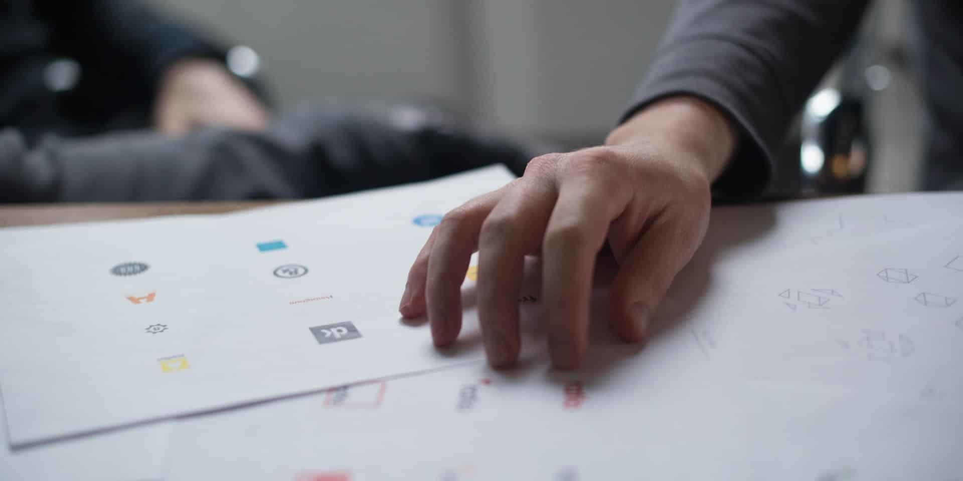
A modern logo is a collection of both classic and trendy elements. Combined, these create a brand mark that is fresh and stylish. As a business owner, it’s important to know the kind of design you’ll use for your business. Here are a few examples of modern styles and designs.
Minimalism
Try to drop the extra designs and embellishments. Logos that feature minimal style trend because a minimal styling of a logo is a modern take on logos and it’s been evolving for a while as more designs feature flatter styles, fewer colors, and fewer words.
Gradient
Gradient designs are one of the more popular and best color trends. Gradient designs nowadays are bright and bold, anything but boring. The modern logo takes on gradient features to make them obvious.
Text in a box
Logos like these are examples of how minimalism and readability are making an impact in design A logo style that takes on a minimalist approach can be easily read and can be highly functional. This style would work best with clean lettering of the logo.
Icons and texts
This has got to be one of the easiest and most common designs of a logo—a text and icon element placed next to one another. Icons and text are separate elements that have been brought together to solidify a company’s branding.
Slack, a common communication platform in corporate settings said this about its recent logo change: “A good reason to change a logo is that it’s not doing the job you want it to do—and because a simpler, more distinctive evolution of it could do that job better.”
Hand-made
Our tip to making hand-made/hand-drawn logos is to make sure that it’s clean and not sloppy.
Details
This design style is a bit different from what we’ve been trying to sport for the whole blog. Intricate details and fine lines for icons and type are a trending element. This style is popular because it sports a vintage style that features more classic elements.
Bold, Bright Colors
This can obviously help a logo stand out. Designers play with colors and can sometimes come up with a playful yet eye-catching color scheme that’s pleasing to the eyes.
Shapes (Squares and Circles)
There is no rule that logos need to be a certain shape but squares and circles are the most common shapes used for logos.
Brands that use squares or circles for logos can be considered as practical companies because sometimes logo trends can be influenced by the most practical applications such as using these square/circle logos as profile photos or social networking sites.
Typography
One logo trend that never goes out of style is the use of interesting typography. The most popular type of typography is sans serif.
There are so many logos in the world. Yet, among the millions or even billions of logos in the whole entire world, not all seem to represent the brand it should… properly. Why is this so? How do you sort through all the clutter to create a logo that has a purpose four a brand/company?
Creating a logo is not an easy task. The best logos are not only designed well, but they have meaning/purpose. It creates a connection between the icon and the actual company it represents.
Here are some things to think about as you tackle creating a logo so that it has a purpose.
First, you should be able to identify a logo
When creating a logo, think of your user/customer. A logo design should, first and foremost, be identifiable in a way that anyone would be able to identify it. By doing this, you’re securing your connection with the brand you’re representing. The key component of identification is with your target audience.
It’s true that it should be modern but not too trendy
You might be thinking, “that’s completely contrasting!” Trust me, it isn’t. Having a trendy logo would mean you’d have to constantly redesign to keep up with the trend while having a modern logo means that the logo stands the test of the current times and isn’t too dated but won’t be a pain to keep redesigning. How will you establish a purposeful and memorable brand design if it is constantly changing?
Connect it to your brand
Establishing this connection should be a the first thing to think about. Imagine having a company about nature but having no green in the logo. Something new and innovative can help establish the purpose of your company. People pick up on these and a dozen other visual cues and these little things can communicate a great deal.
Simplicity
Think of how much quicker your logo can be identified if it was a simple one. There won’t be a need to decode a complex one with all the hidden meanings in it. A complex logo can be a challenge to decipher and understand, both of which you don’t want to have for your logo.
Create an impression
Logos with purpose will create an impression no matter what. The impression should last from the first they see your logo. What did they do after seeing it? Did they engage with your brand or did they just ignore you? An impression can influence the relationships you establish with your brand.
Flexibility
Logos today are used for a lot of things. It can be online, print, and the design needs to be flexible so that the brand can be shown in various ways. This also applies to the shape and different dynamics of design like color, ability to adjust to specific situations.
Stands for your brand
A logo’s main job is to identify and bring recognition to a brand but a purposeful logo conveys what you stand for. Sounds impossible but it’s actually possible
Conclusion
A modern logo design tells potential customers or website visitors that your brand or business is hip and interesting. A solid logo can really create credibility and trust. Learn how to translate your values into an amazing logo that can represent your brand and its brand values and all.
We provide any and all kinds of design services like logo design and branding. If you need any marketing or advertising needs, feel free to contact us here.